Picasso said "Learn the rules like a pro, so you can break them like an artist."
We take pride in our disruptive, rule-breaking approach at Maverick. Saying that, it’s our job to understand the rules before we can break them effectively. No matter what venture we embark on in the Maverick Studio, we take the fundamentals of best practice design into account.
These principles provide an overarching framework for our designers to follow when deciding how each project is brought together. We detail 13 of these design principles below.
Balance
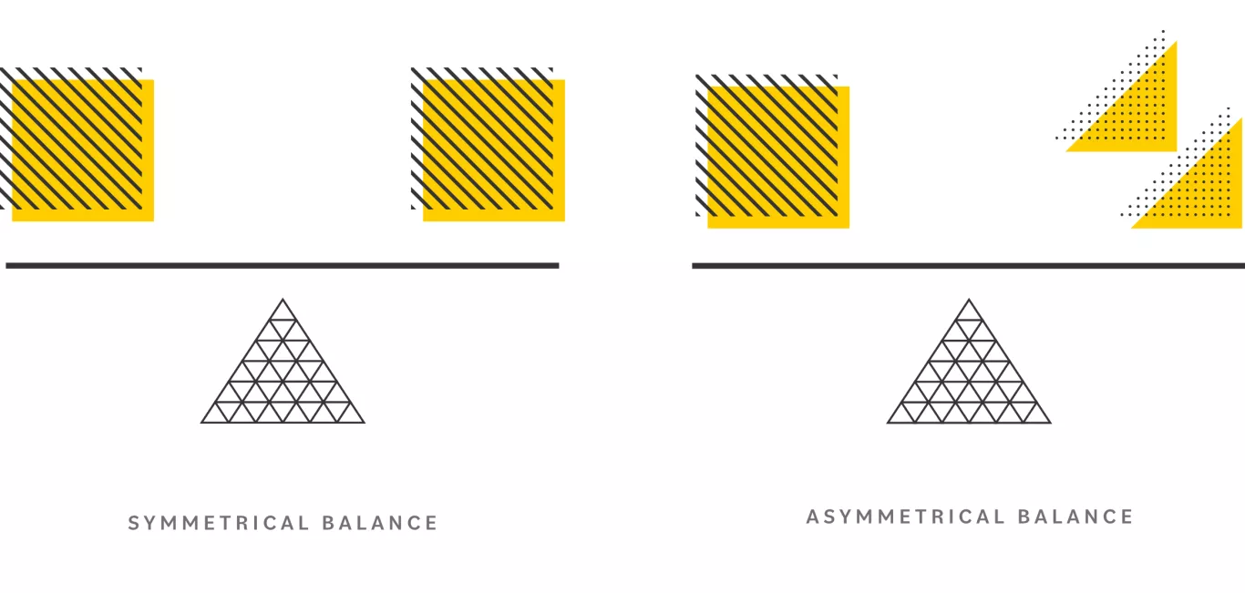
Balance is an essential design principle for creating visually appealing and steady compositions.
Balance can be achieved in many ways, including symmetrical, asymmetrical, radial and geometric design elements. It is essential to consider the aspects of a design before making any decisions on its balance, as balance will determine how effective it is at conveying its message.
For example, if a design emphasises one element, such as colour or text, over all others, the overall composition may appear unbalanced and cluttered. On the other hand, if all aspects are given equal importance and attention, the design will appear harmonious and cohesive. Use appropriate space, contrast, colour, texture, and other design elements to achieve balance in your designs.
Contrast
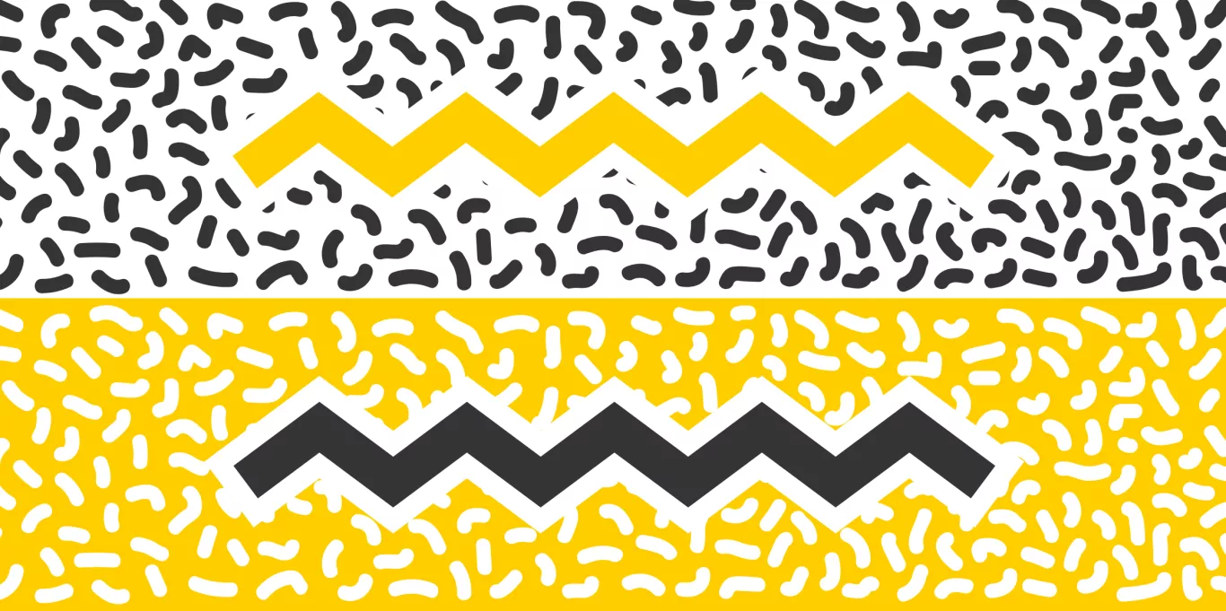
Contrast is a design principle that emphasises the differences between elements to create visual interest and attract attention.
Contrast can enhance aesthetic appeal, make designs more striking, and draw focus to important features or content. Contrast can be achieved through colour, size, shape, texture, typography, spacing, and movement. It can also create visual hierarchy and structure within a composition. As a result of its versatility, contrast is an important tool that our Maverick designers use when creating compelling visuals.
Hierarchy
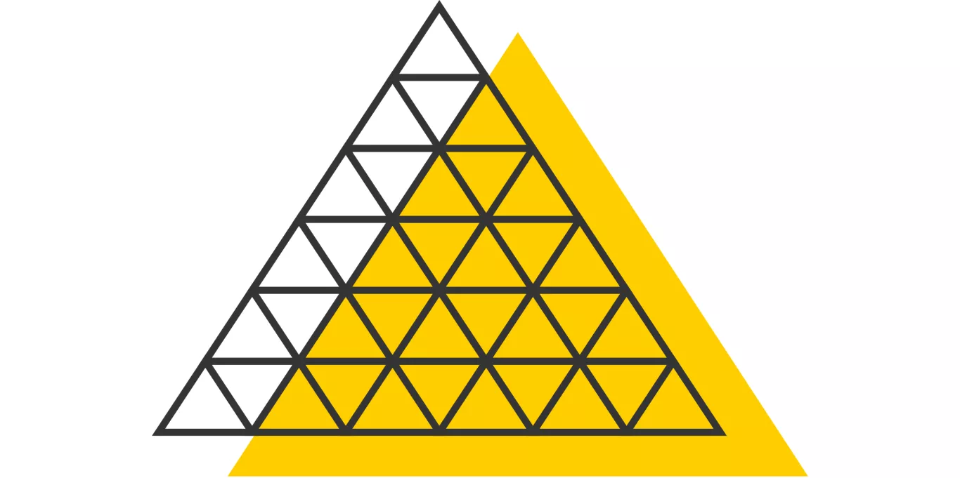
The concept of hierarchy in design is about creating order and structure within a composition.
It involves arranging elements on a page or screen so that users can quickly scan, understand, and navigate the content. Hierarchy allows for the organisation of information from most to least important, making it easier for people to process the content they are presented with.
The goal of hierarchy is to create a sense of flow and balance throughout the design. This can be achieved by using size, colour, contrast, and placement of elements to create visual cues that guide viewers' eyes through the design. Establishing a solid hierarchy helps ensure your message is received loud and clear.
Proportion
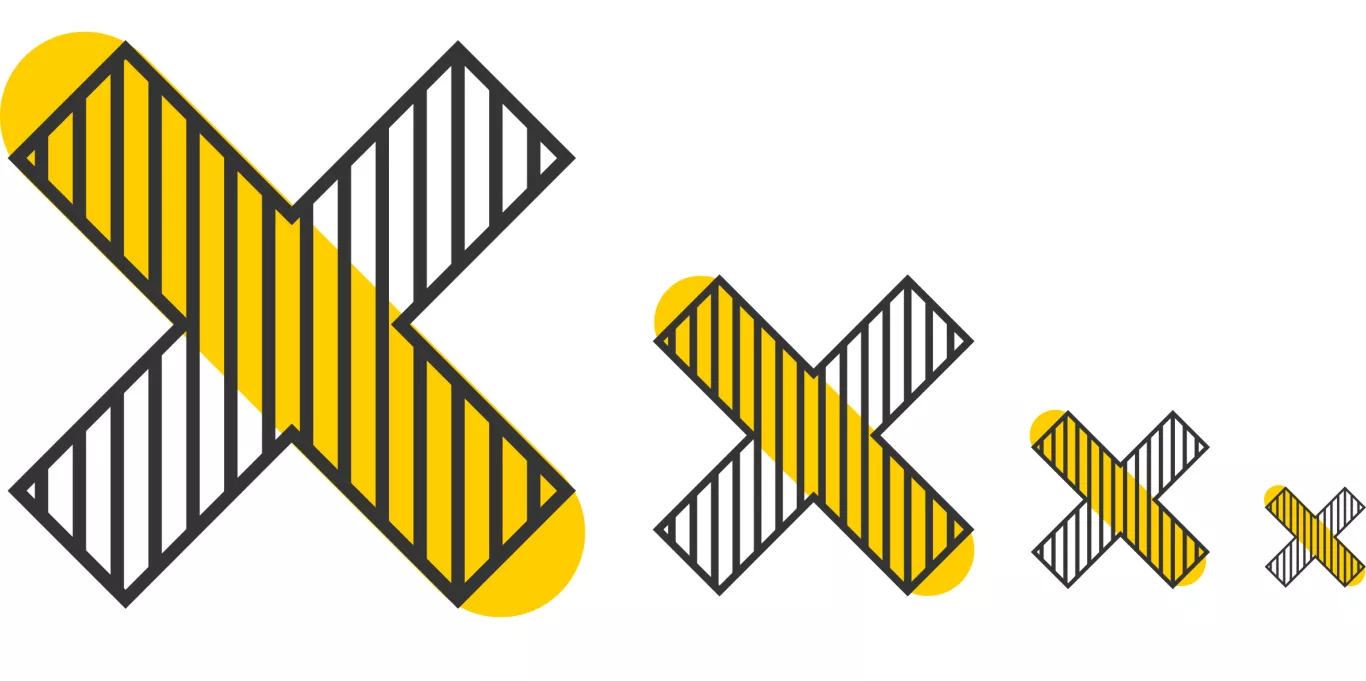
Proportion is the size relationship between elements in a design. It refers to the ratio of sizes, distances, and angles in a design.
It's important to consider proportion when designing visual images, layouts, and other forms of artwork because it can create balance and harmony in the composition. Proportion also helps to convey meaning and emotional impact by creating emphasis or unity.
Different proportions can be used to communicate various ideas or messages. For example, a large element may represent dominance or importance, while a small element may represent fragility or delicacy. Properly using proportion in a design creates an engaging and aesthetically pleasing final piece.

Alignment
Alignment is critical in the composition of visual elements as it creates a sense of order and structure in a design. Alignment also helps create balance and harmony between different design building blocks.
This includes aligning text, images, colours, shapes, lines, and any other asset associated with a structure. Proper alignment can enhance the aesthetics of a design while helping the viewer better understand the message conveyed.
Pattern
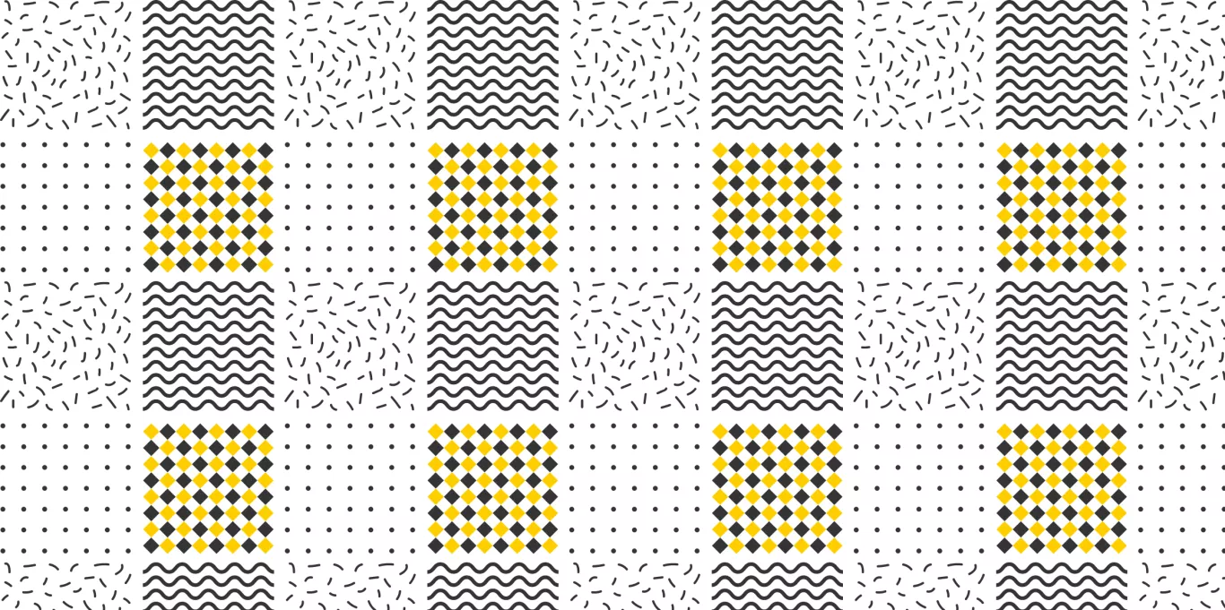
The pattern is based on creating balance and unity through different shapes and textures. A pattern can be used to unify design elements and make an overall sense of order, harmony, and rhythm.
The patterns used in design can range from simple geometric shapes to complex organic forms. With careful consideration, pattern can also be used to draw attention to certain areas of the design or create focal points within the composition. Additionally, repeating patterns can help reinforce branding and identity while highlighting key features of a product or service.
Rhythm
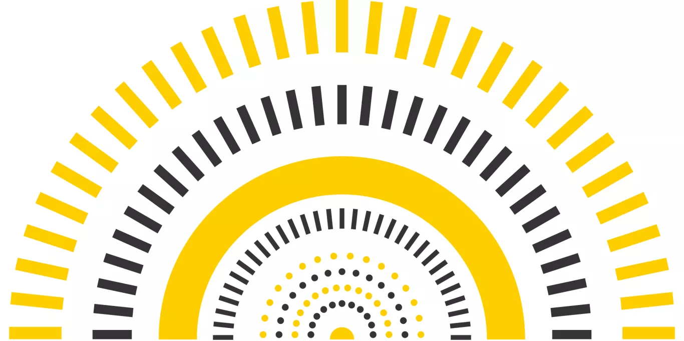
The concept of rhythm is about creating a flow and balance in a design to bring it together as a complete piece. Rhythm refers to the pacing of the design, with alternating elements and textures providing visual interest. It's about presenting the right information at the right time.
By understanding how rhythm works in design, designers can create cohesive pieces that are aesthetically pleasing and capture their audience's attention.
White Space
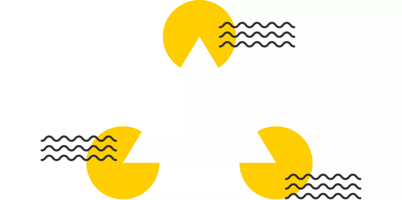
White space, also known as negative space, refers to the areas of a composition that are left untouched or unoccupied by any other elements.
White space can create balance, emphasise certain elements, and direct the viewer's eyes towards critical components of your design. When used correctly, white space can help make designs look more aesthetically pleasing and polished. Additionally, it can give your work a sense of sophistication and elegance while helping to make complex information easier to digest.

Variety
Variety is essential to creating beautiful designs. Variety breaks up the monotony, adds interest, and keeps viewers engaged. Variety can be achieved by altering sizes, integrating diverging shapes, contrasting colours, varying textures, and fluctuating typography.
Furthermore, it is essential to consider how each element works together to create a compelling and cohesive visual experience. By using various techniques, you will be able to craft unique designs that are visually harmonious and functional.
Emphasis
Emphasis in design refers to a composition's focal point or most dominant feature. It can be achieved by manipulating design facets such as colour, size, shape, and texture.
The emphasis should draw attention to the most important aspects of the design while still creating balance within the composition. It is important to consider how different elements interact to create this balance. When used correctly, emphasis can make a powerful visual impact that allows the viewer to understand the intended message easily.

Movement
The main principle underlying movement in design is to create a sense of dynamism and energy. Movement can draw attention, emphasise essential elements, or simply provide a delectable visual effect.
For example, using curved lines instead of straight ones, adding animation to interactions, or making objects appear to be pushed around the screen are all ways to add movement to a design. Additionally, creating transitions between different design sections can make it feel more natural and cohesive.
Movement should also be used to strike a balance with static elements; too much motion can become overwhelming, while too little can make a design look lifeless.
Repetition
Repetition is one of the most important principles of design. It involves repeating certain elements or patterns throughout a design to create a cohesive and unified aesthetic.
It creates a sense of order and cohesion in a design, allowing the viewer to recognise elements easily. In addition, repetition can be used to create visual rhythm and establish a sense of continuity throughout a design. Repetition is also a great way to add interest and movement to a design, as the repeated elements create a visual rhythm that can be pleasing and eye-catching.
Unity
Unity is a design principle that stresses creating a unified and cohesive look for an entire project. This includes considering how each element interacts with one another, how they work together to communicate a message or theme, and how overall harmony can be achieved.
The goal is to create a piece that looks and feels complete and connected. Unity ensures that all parts of the design fit together to form a harmonious whole. This includes deciding on a colour palette, typography, iconography, layout, and more. When used effectively, unity helps give a project structure and consistency.
Conclusion
It's easy to see why these design principles are the fundamental concepts to guide design decisions and create beautiful, functional designs in our studio. They provide a framework for our designers to follow when creating user interfaces, whether digital or real. Sound design principles help ensure the work Maverick produces for clients is consistent, aesthetically pleasing and easy to use.
Further Reading
See how the Maverick Studio approaches the art and science of logo design.
For additional reading and insights into all the above, please browse the references we've listed below.
Hierarchy by Flux Academy
Alignment by Design Mantic
White Space by Adobe
Repetition by GraphicsZoo


