Thinking / Insights
The art and science of logo design
Author
Logos, so what?
Logos trip people up. The word logo denotes fun and easy, with a throwaway quality like knick-knack or flipflop. The reality, however, is that there is a real science to logo design. All too often, logo design principles that combat subjective opinions are overlooked, leaving great companies with logos that don't reflect their true quality. The great designer, Paula Scher, whose work includes the CNN and Citi Bank logos summed it up beautifully; “It took me a few seconds to draw it, but it took me 34 years to learn how to draw it in a few seconds.”
“It took me a few seconds to draw it, but it took me 34 years to learn how to draw it in a few seconds.”
Paula Scher
A good logo exudes meaning. It doesn’t necessarily need to have an ambitiously clever visual pun to illustrate this meaning.
The most intentionally pared back logos are often the most celebrated. They identify the qualities of a company clearly without adding any visual noise. Paul Rand, the godfather of logo design stated; “A logo derives its meaning from the quality of the thing it symbolises, not the other way around. A logo is less important than the product it signifies; what it means is more important than what it looks like.”
At Maverick we’ve seen time and time again, that the right logo separates you from the competition and fosters brand loyalty.
“A logo derives its meaning from the quality of the thing it symbolises, not the other way around. A logo is less important than the product it signifies; what it means is more important than what it looks like.”
Paul Rand
Logos must be simple
"Cognitive load" relates to the amount of information that working memory can hold at one time. Since working memory has a limited capacity, instructional methods should avoid overloading it with additional activities that don't directly contribute to learning.
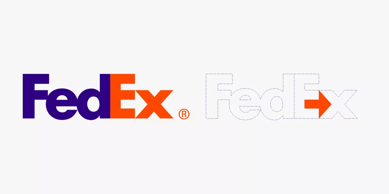
Put simply, a complex logo is harder to digest than a simple one. If you want your logo to be memorable, keep it simple. Unnecessary visual details result when a logo designer tries to be too descriptive, and rather than clarifying an idea, they can overwhelm the audience. Good logos feature something unique without being too complex and cluttered. An example of a simple idea brilliantly executed is Lindon Leader’s Fedex logo.
Logos must be unique
The more unique the logo, the more memorable it will be. With more and more businesses understanding the importance of intelligent branding it is getting increasingly difficult for designers to conceive truly unique work. There are only so many words, so many colours and so many compositions.
To fit into an industry, brands tend towards cliché visuals e.g. telecom brands using globes. An accomplished designer will research the competition and identify the company's key personality traits to create something unique.

Logos must be timeless
Unlike other brand assets, a logo is constructed to be permanent. It should therefore be timeless and not trendy. A trap many fledgling creatives fall into is designing for today’s aesthetic, for example, incorporating a fashionable typeface, or decorating with a colour de jour.
This generally comes from a lack of perspective rather than an intentional oversight. Their logos seem to be fresh when devised but they quickly date and become obsolete.
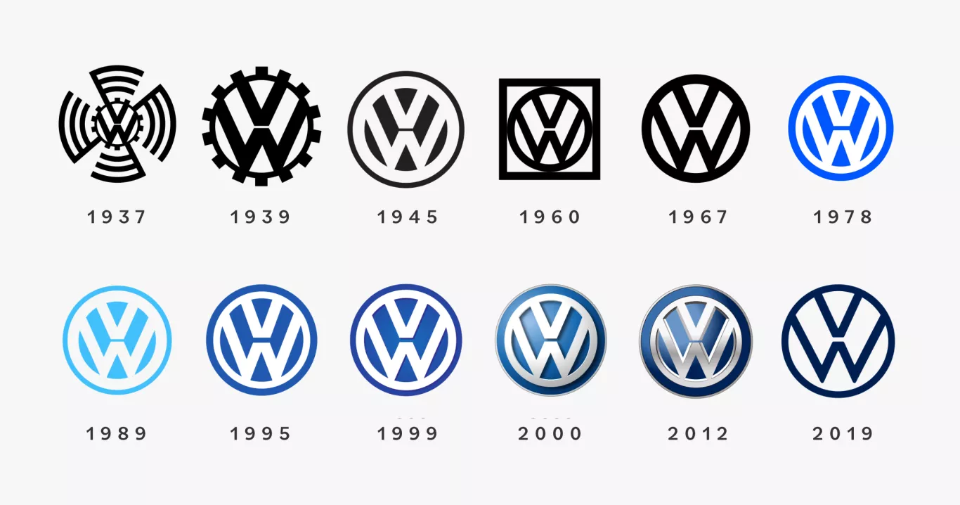
Logos will evolve. Generally, these subtle tweaks will reflect either a change in application or the brand’s personality or direction. A well-designed logo will have a form that can stay true over decades despite these tweaks.
Logos must be versatile and scalable
A logo’s home is never in only one particular setting. It needs to communicate as successfully overlaying rich content, as it does on a block colour background. A solid rule of thumb is that a logo’s form should be as easily identifiable in black and white as it is in colour.
A logo must work at any size. A great logo will be easy to read and recognise, no matter where it's seen - be it on the side of a building or the side of a pen. The more detail a logo has the harder it is to interpret at smaller sizes. Logos today are adaptive and can be different sizes, complexities, or even colors to accommodate their placement.
Logos must be appropriate
A logo should be fit for purpose. This seems obvious, right? 85% of the logos we are asked to redesign at Maverick were, originally, in no way appropriate for their industry.
For a logo to be appropriate, the logo maker must have a handle on the target audience including; their gender, age, location, income, occupation, and expectations. You want to stand out in your industry but it should fit that industry. A toy shop’s logo should be fun and energetic, an internet security firm should transmit trust and solidity.
Conclusion
A logo is a keystone to any business’s brand. When investing in a logo it is incredibly important to work with a studio that truly understands all the facets of your brand personality, the people you want to engage with, and have a complete picture of where the logo will live.
Thinking about your company logo design? Speak with Andy and the design studio at Maverick for a consultation. We create designs that inspire brand loyalty, inviting people to think, feel and act.
UNLEASH YOUR ORGANISATION’S POTENTIAL
Transform
Empower your organisation with world-class positioning, marketing and branding.
A highly structured, tried-and-tested programme that will drive transformational change in your branding, communications and marketing. This unique, B2B Marketing programme, has been born of, and honed by, 20 years of focused exploration and practice. In this comprehensive PDF we outline the programme in detail, including the stages, tasks, roles, responsibilities, dependencies and outputs.
Contact
Let's Talk
Contact us by filling out this form and we’ll direct your query to the most appropriate person.


